Use Your Product Before Actually Using It
User Interface Design: Wireframe and Mockups

While developing a product, we often need to visualize how our product will look like. Even more, we want to know how our product feels when being used. Because doing so gives us a good picture of the product in our head, and helps us to have a clear goal when developing it.
One way to make it happens is by actually design the product’s interface. Making a visual design of our product helps us in developing the product. The visual design does not focus merely on the product’s aesthetic, it also aims to improve the usability of the product with suitable images, typography, space, layout, and color. The components are used carefully to optimize the user experience.
In developing our product, we may want to visualize our product for various purposes. It is not limited to wanting a clear guide to develop the product, it also affects the business matter of the product. For example, we may need a proper visualization of our product to convince the stakeholders. That way, we need a mockup of our product.
When designing an application or a website, there are certain levels of visual representations. Those are wireframe, mockup, and prototype. Each of them helps the designer to visualize the design at various degrees of detail. Let’s talk about them more below.
Wireframe
A wireframe is a low-fidelity way of showing a product design. It’s the visual representation of an application or a website that contains the most important elements. It describes the basic structure, function, and content of the page of the website or application.
A wireframe is like a blueprint, we use it as the first step when designing an application or a website. So its goal is to quickly and easily communicate the content of the website or application. It shows the outline and layout structure of the page.
One of the advantages of creating a wireframe is that it is not expensive and it’s fast. We can use it to show the basic design to the stakeholders and ask for their feedback. The other advantage of the wireframe is that it is not focused on the aesthetic of the page, so it gives more attention to the functionality.

Mockup
A mockup is the next iteration of the wireframe outline. It’s more in-depth than the wireframe, and it includes more stylistic and visual details to present how the product will look, instead of only its structure. It is a medium-fidelity of product design. But still, a mockup is not clickable.
A mockup helps us to communicate how the final interface will look to the stakeholders. It gives the stakeholders a chance to preview the design and style choices, and we can make the necessary changes right away. This is more efficient than having to make adjustments to the interface after we launched the product.

Prototype
A prototype is a high-fidelity representation of the product. It’s the next iteration of the mockup, and to put it simply, it is a clickable mockup. Thus it allows the user to experience the interaction with the product. It is very much like the final product. That way, we can figure out whether the stakeholders like it or not.
A prototype is used to reduce the development costs until the user interface is approved. A prototype can help the developer too to notice some bugs in the user flow. In my case, it helped me to notice where to redirect a page after a certain process. Once the prototype is approved, the team can go on with coding the product.


Tools
There are many tools to design wireframes, mockups, or prototypes. For example, Figma, Mockplus, Adobe XD, etc.
In my current project, we use Figma to design all our wireframes, mockups, or prototypes. It makes working together easier and cheap.

10 Usability Heuristics for User Interface Design
When designing our product, we cant design it whichever we like. There are certain things to be aimed such as visual appeal, usability, etc. 10 Usability Heuristics for User Interface Design is one of the principles for a good interaction design. Here’s how my current project implements it.
Match between system and the real world
The design needs to use words, phrases, and concepts that are familiar to the user, rather than only internally understood. It also needs to make information appear in natural and logical order.

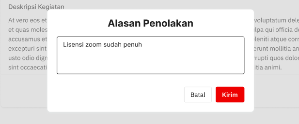
In my current project, we use the word ‘kirim’ in the booking rejection reason page. That way, it is more familiar to the user that they will send the rejection reason to the booker, rather than only a ‘submit’ button.
User control and freedom
Users sometimes may perform an action by mistake — and we know how stressful it is. Therefore, we need to gives users an option to leave the unwanted action without having to go through a long process.

In my current project, on the ‘Detail Pemesanan’ page, we provide a button that enables the user to cancel their booking — before it is being accepted by the admin. This way, it is easier for the user when they want to cancel a mistaken booking. We also provide an edit button if they want to edit their booking.
Consistency and standards
Users should not need to think about whether different words mean the same thing.


The images above are the example of the implementation in my current project. We use the same word ‘Batal’ for the cancellation button. It is easier for the user rather than using different words like ‘Batal’ and ‘Kembali’.
Aesthetic and minimalist design
Interfaces should not contain information that is irrelevant or rarely needed.

In my current project, we use a minimalist design in our pages. For example is in the Login page, where we only show the input fields needed for login.
Error Prevention
It is better to prevent an error than to solve it. We can do it by either check user’s action or present a confirmation option for the user. In my current project, we gave a confirmation pop-up before certain important actions, such as deleting a permanent user’s license.

Recognition rather than recall
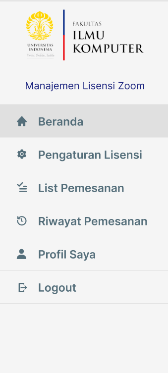
It is important to minimize the user’s memory load. It is easier for them to recognize rather than recall. For example, menu items should be visible or easily retrievable whenever the user needs them. In my project, it is implemented in this sidebar.

Well, We Tried Our Best
Ideally, we want our project to follow each of the usability heuristic principles. However, limited time and skill might sometimes prevent us to make the most perfect design. Well, that’s what my team was facing—but, well, we’ve tried our best. So here are some usability heuristic principles that my team has yet to implement in our prototype design.
Visibility of System Status
Visibility of system status means that the design should always inform the user about what is going on, by giving feedback within a reasonable amount of time. This way, the user will know the current system status and they can determine their next step. Predictable interactions like this will create trust in the product.
In my current project, we implemented it in our code, but not in our design.

In the example above, we show an alert that the page is currently loading its data. This way, it tells the user what the system is currently doing. But we did not design this in our prototype, it came along the way when we code the page. The main reason simply because we did not think about this case yet, and it’s also quite complicated to design each feedback given from the page into the prototype — given the limited time.
Help users recognize, diagnose, and recover from errors
In unexpected situations, it is easy for the user to be panic. We need to design our page to help the user recognize the error — by using easy words — and recover from the error.
In the same case as the previous principle, in my current project, we directly implemented this principle in our code without designed it in our prototype beforehand, for the same reasons.

The example above shows that the page tells the user that they typed the wrong credentials and they should try it again.
Flexibility and efficiency of use
Shortcuts for the advanced users may speed up the actions for the tasks they need to do. But in my current project, we have yet to think that far about the need for shortcuts for advanced users.
Help and documentation
The ideal condition of a system is that it doesn't need any additional explanation. However, it may be necessary to provide documentation to help users when they need it to complete their tasks. But in my current project, we have yet to make the documentation and yet to provide it in our website.
And that’s it! You can see that making prototypes is a way that allows you to use your product before actually using it. It is really important to make a good design for the user. So making wireframes, mockups, prototypes, and following the design principle is really helpful when developing a product. But we must remember that it is impossible for us to create a perfect design — there are countless error possibilities that we may not be able to think of first. However, we can enhance it little by little when we find the design flaws while developing the product.
