What I’ve Learned About Design Guidelines
Design Guidelines, Product Branding, and Design Kit
Designing for a client is not as loose as to how you want it to be. Each of the designs has purposes and functions. For example, it can be used for the company’s branding, or to enhance user experience. In this article, I will share what I’ve learned about design guidelines in User Interface design.
Product Branding and User Interface
Branding is the set of marketing and steps aiming to promote a product by firstly setting a brand. In this case, brand means a sort of image created via distinguishing features and promoting activities, and recognizability of the product in the market.
In graphic design, branding can be realized via visual elements such as logo, brand colors, typography, etc. In User Interface design, branding means all set of visual elements defining the brand style that can be applied in the interfaces.
The visual elements applied in the interface can create powerful visual recognizability for the product. It can be a powerful branding strategy as visual perception is more memorable than a text or speech. There are two ways to connect between branding and User Interface.
Branding to UI
Branding is essential in UI, especially in the case where we want to use the interface to increase brand awareness. Personally, I think from branding to UI is the best way to design. If there’s an appropriate time to do research and to create branding elements such as logo before designing the UI, the product will get easier to be recognized.
The reason is that the UI designer will follow the previously made branding concept to design the interface. This way, it provides a more consistent and harmonic feeling for the brand — which is one of the 10 usability heuristics principles that I’ve discussed in the previous article.
UI to Branding
In some cases, such as startups that still have a limited budget, it is not possible to design the UI after the branding concept is done. It may have to progress at the same time.
But it’s still okay, the UI and the branding may have a different concept, but they would still somehow work to engage and attract users separately. Though, the UI may not work on brand recognizability as effectively as the Branding to UI.
If the UI is greatly designed, and on top of that the product is useful, when it gets more popular, there can be a reverse process: the UI becomes the strong element of branding. In this case, if later the owner decided to change the graphic assets of the branding, it may be based on the already existing UI graphics, as it already represents the product.
My Current Project
This knowledge of using User Interface as a branding tool is new and really interesting for me. Because sometimes I’ve noticed there are some websites that have a different design concept with their logo or social media marketing design, and it kinda disturbs me. Learning this concept of branding and UI makes it clearer for me why it disturbed me back then and how I should design my future projects.
Sadly, in my current project, there is no particular branding of the company as it is a project from my faculty. There is no specific company logo — at best is the faculty logo — and all the previously made faculty websites have no consistent designs between them. Here are some examples of these websites.
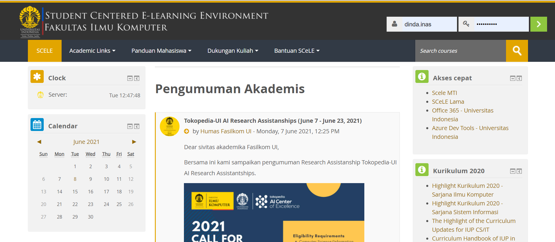
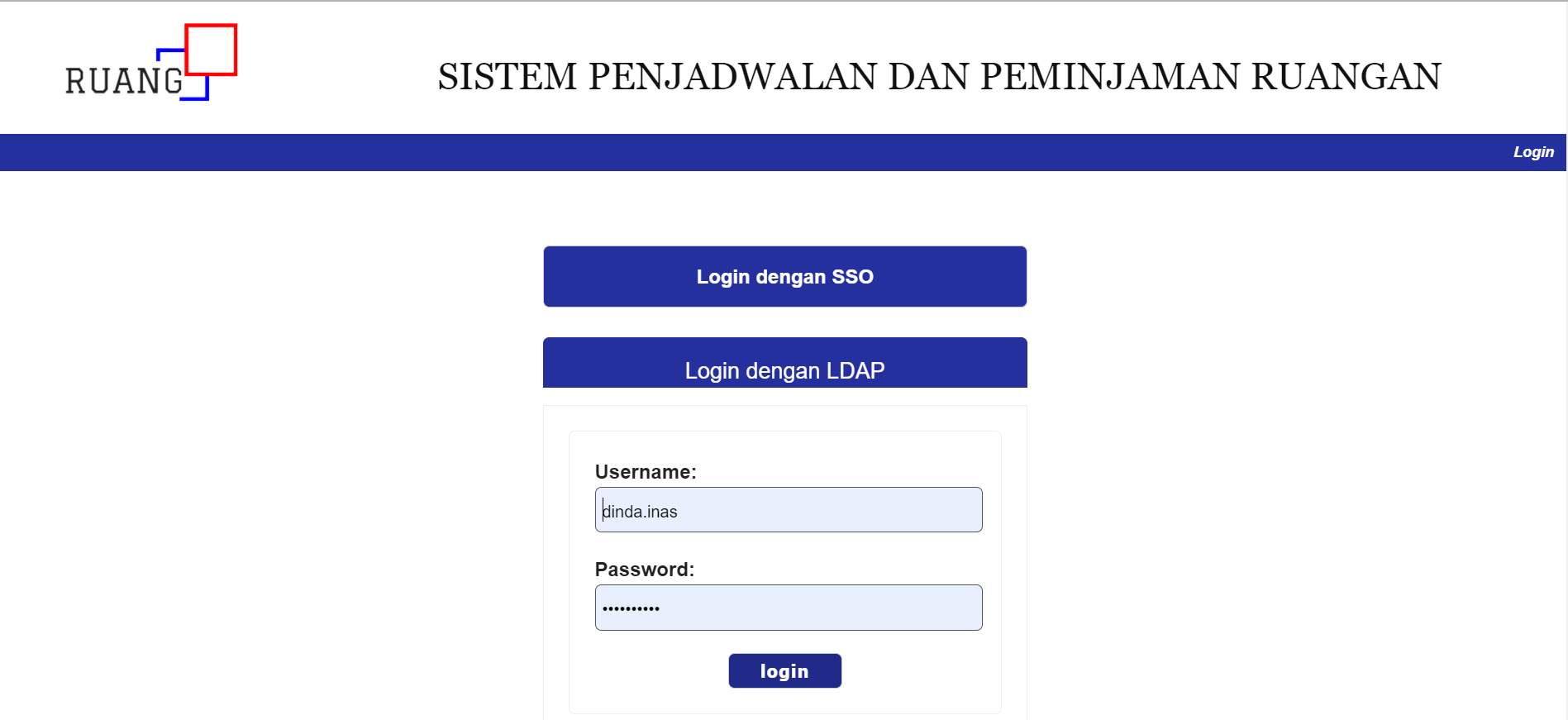
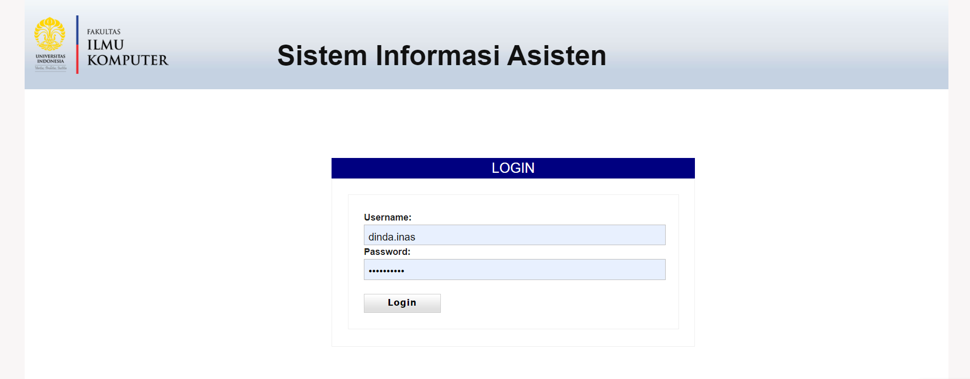
From the pictures above, it can be seen how there is no particular branding between all these websites. They have different color palettes and even logos. Some use the faculty’s logo, the other use the website’s logo.
It confused my team on how to design our project’s website. There were also no significant rules from the faculty. So we directly designed the User Interface without previously thinking about the general branding concept.
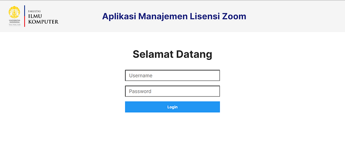
We figured to at least put the faculty logo and gives a big header in the UI, similar to some of the existed websites. One thing that I relate to the UI to Branding concept is that each UI of the faculty websites actually makes me easy to distinguish each of them. It kind of like the branding of each website individually. Though it also makes me feel like it’s from a different company.
Design Kit
One of the ways to make the branding design consistent is to use a design kit. A design kit or branding kit contains the important visual elements of the brand identity, such as the logo, font, and color palette used by the brand.
Here is an example of a branding kit.
It is important to have a design kit or brand kit to ensure that anyone creating content for the company to be consistent with the colors, font, and logos. This consistency creates trust for the user.
However, as I’ve mentioned above, the client I’m currently working with is not necessarily a brand. It is one of the faculty on my campus, so it does not have any specific brand logo, font, or color. Thus, my team doesn't get any design kit to be followed.
Design Guidelines
Other than the design kit, there is another tool that can help to ensure our product’s design consistency, that is Design Guideline, or in this case, UI Design Guideline. UI design guideline is a document about the rules on how to design a digital product. It is wider than the design kit, it includes the components and options to be used to design the UI.
The Advantages
We’ve known the importance of using a design guideline is to maintain the consistency of our product’s design. According to the usability heuristic principle, it is important to maintain consistency.
It also functionates as a Single Source of Truth when we’re confused because of the many different design styles used. We can easily refer back to the design guideline to know which one to use.
There are many advantages of using a design guideline, such as:
- Faster workflow — we don't have to be confused about which buttons, pop-ups design to be used
- Designers can focus more on making solutions — instead of thinking about how each of the components should look like
- Helps developer on implementing it to codes — by using the same button design, the developer can reuse the component
My Current Project
When learning about this topic, there’s like a light bulb on top of my head. I thought that it must have been a lot easier back then if my team used this.
In my current project, my team doesn't really have a detailed design guideline. The one below is as far as what we have.
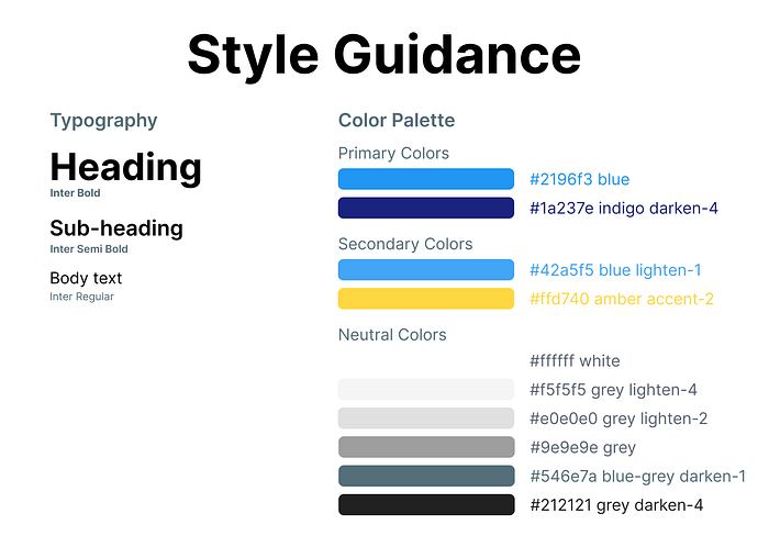
It only has the typography and the color style guidance. There is no explanation of the button nor pop-up components. We kinda designed without planning far back then 😅.
But we still design our components consistently, just like the usability heuristic principle recommended. You can see below that we use the same blue-colored button for the designs.
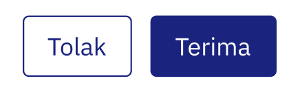

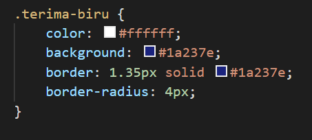
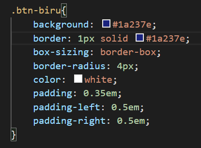
However, things got more chaotic in the coding phase. Because we don't have the design guideline for each component, we made different CSS for buttons on different pages, instead of using the same classes — we didn't realize they were basically the same style.
Creating Design Guidelines
In creating design guidelines for our product, we may not directly know which style would suit the best. Therefore, it is okay to try some styles first before actually making the design guideline. It’s okay to explore.
In this case. I’ll try to recreate the design guideline for my project — it may be late but it can be useful in the future too. Here are some of the steps.
- Color: Lists all the color used in the designs
- Typography: Lists all the font used, both the size and weight
- Add components that are similar on different pages: in my case, it is the buttons
Here are the design guidelines that I recreated. I added the button size details and the button components design guideline.
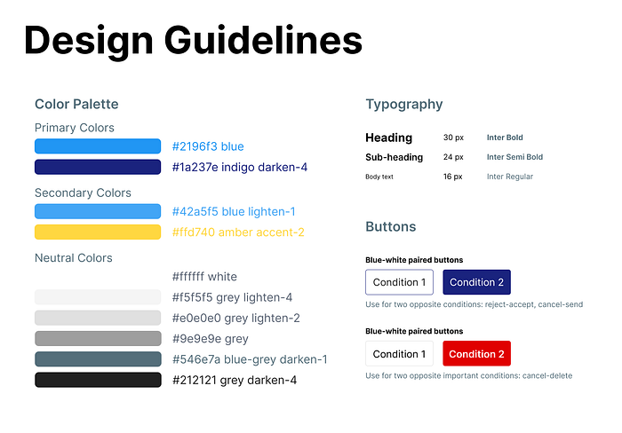
It may be simple but still gives more useful information than the previous one — well I still learn anyway 😅. It is also important to make UI Design Guideline that is easy to use.
So that’s all, folks! I hope this article helps us to understand the importance of branding in UI and design guidelines. I wish you all the best in your own projects and hope you can learn something from my project experience too!
You can also read about the 10 Usability Heuristics Principle — which is also a ‘design guideline’ in a way — in my article below:
